
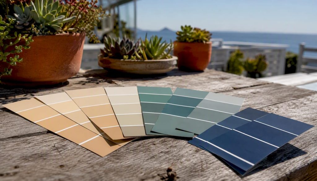
A coastal colour scheme is a warm sand neutral anchored by one or two muted sea-glass blues or greens, with a single deep blue used only as a deliberate accent. That structure is what separates a genuinely coastal interior from a room that just looks cold and blue.
Your starter palette:
- Warm sand base: Accessible Beige (SW 7036) or Agreeable Gray (SW 7029)
- Sea-glass mid-tone: Sea Salt (SW 6204)
- Deep accent: Hale Navy (Benjamin Moore HC-154)
- Trim: White Dove (Benjamin Moore OC-17) or SW Alabaster
Light Reflectance Value matters here. Benjamin Moore’s coastal palette guidance recommends keeping wall colors in a mid-to-high LRV range so rooms stay airy without reading as stark. Matte or eggshell finishes on walls, creamy white trim, and one purposeful deep-blue accent are the three structural rules that hold the whole palette together.
Key takeaways
A coastal colour scheme works when a warm sand neutral anchors the palette, muted sea-glass tones add depth, and a single deep blue accent is used with restraint.
| Point | Details |
|---|---|
| Warm neutral is the anchor | Start with Accessible Beige (SW 7036) or Agreeable Gray (SW 7029) to keep blues from reading cold. |
| Reserve deep blue for accents only | Hale Navy (BM HC-154) or Stiffkey Blue (F&B 281) works best on a single surface, island, or door. |
| Test swatches on the actual wall | Observe at morning, midday, and evening light for at least 48 hours before committing. |
| Match trim to the base undertone | White Dove (BM OC-17) or SW Alabaster harmonizes with warm sand neutrals; cool whites fight them. |
| Limit palette to 3–5 colours | Add depth through texture and material finishes rather than additional paint colors. |
Table of Contents
- What makes a coastal colour scheme work: 14 ready-to-use palettes
- How do you build a coastal palette that stays warm and cohesive?
- Room-by-room coastal palette recommendations
- Trim, ceiling, and finish choices that complete a coastal look
- How does light direction change coastal colours in your home?
- Which paint brands and codes work best for coastal palettes?
- How to test swatches and prepare before painting
- Sources
What makes a coastal colour scheme work: 14 ready-to-use palettes
FacadeColorizer’s coastal paint guide structures its palette recommendations around wall color, trim, accent, LRV, and mood so readers can take swatches straight to a paint counter. The table below follows the same logic.
HGTV Home by Sherwin-Williams’ relaxed coastal collection groups watery greens, sandy neutrals, and beach-friendly whites in a similar way, which confirms that these pairings hold across multiple brand systems.
How do you build a coastal palette that stays warm and cohesive?
The single biggest mistake is starting with a cool gray base. Cool grays push the blues and greens in a coastal palette toward icy or clinical, and no amount of driftwood accessories fixes it. Start with a warm greige or creamy white instead, and the sea-glass tones read as relaxed rather than cold.
Benjamin Moore’s palette guidance notes that muted, slightly grayed saturation is what makes coastal palettes read contemporary rather than literal. Vivid primary blues break the mood. The Spruce’s beach color guide makes the same point: dusty, desaturated tones are the signature of a palette that actually works.
Framework for assembling a coastal palette:
- Pick one warm neutral for walls (LRV 55–70 for living areas, higher for bathrooms and entries)
- Add one sea-glass blue or green as a secondary color for built-ins, cabinetry, or a feature wall
- Reserve one deep blue (Hale Navy, Stiffkey Blue) for a single accent surface only
- Choose a creamy white trim that shares the warm undertone of your base
- Limit the total palette to 3–5 colors, then add depth through texture and material
Sea Salt (SW 6204) is the classic example of a chameleon color: it shifts from blue-gray to soft green depending on light direction and time of day. That behavior is useful, but it also means you need to test it on-site before committing.
Pro Tip: When decorating multiple connected rooms, architect Laurie Fisher’s Sherwin-Williams recommendation applies directly: run one grounding neutral through every room as the anchor, then vary the sea-glass and accent tones by room. The palette reads as a unified system rather than a series of disconnected choices.
Room-by-room coastal palette recommendations
Living room
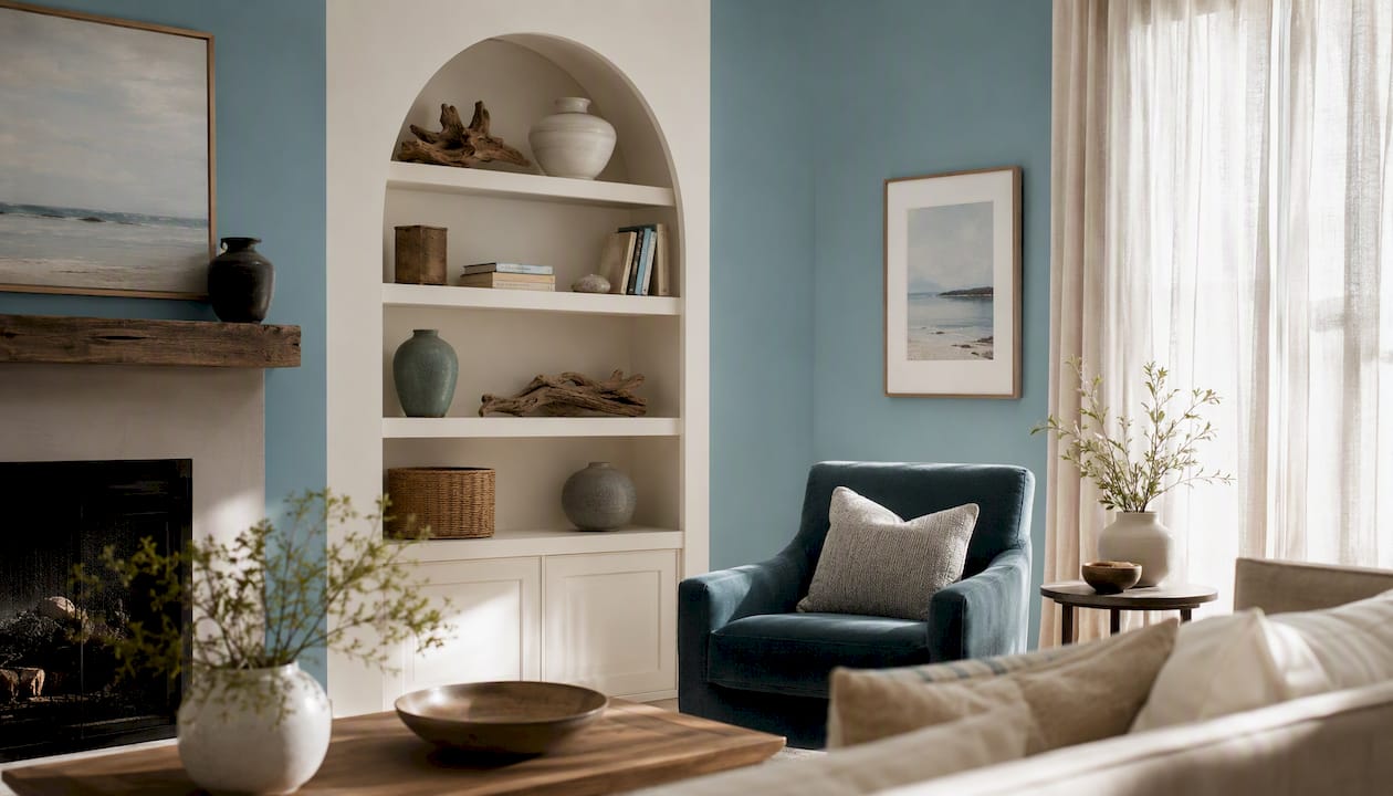
Warm sand on the main walls (Accessible Beige or Agreeable Gray) with Sea Salt on a built-in bookcase or alcove reads as layered without being busy. Keep the deep blue in accessories, a single armchair, or a throw. Homes & Gardens’ coastal colour schemes show how calm, modern coastal interiors use this restraint consistently.
Bedroom
Washed blues and muted greens work well here because they lower visual energy. Evergreen Fog (SW 9130) on all four walls with White Dove trim and linen bedding is a combination that photographs well and sleeps even better. Avoid anything with a purple undertone in a bedroom; it reads as cold under evening light.
Bathroom
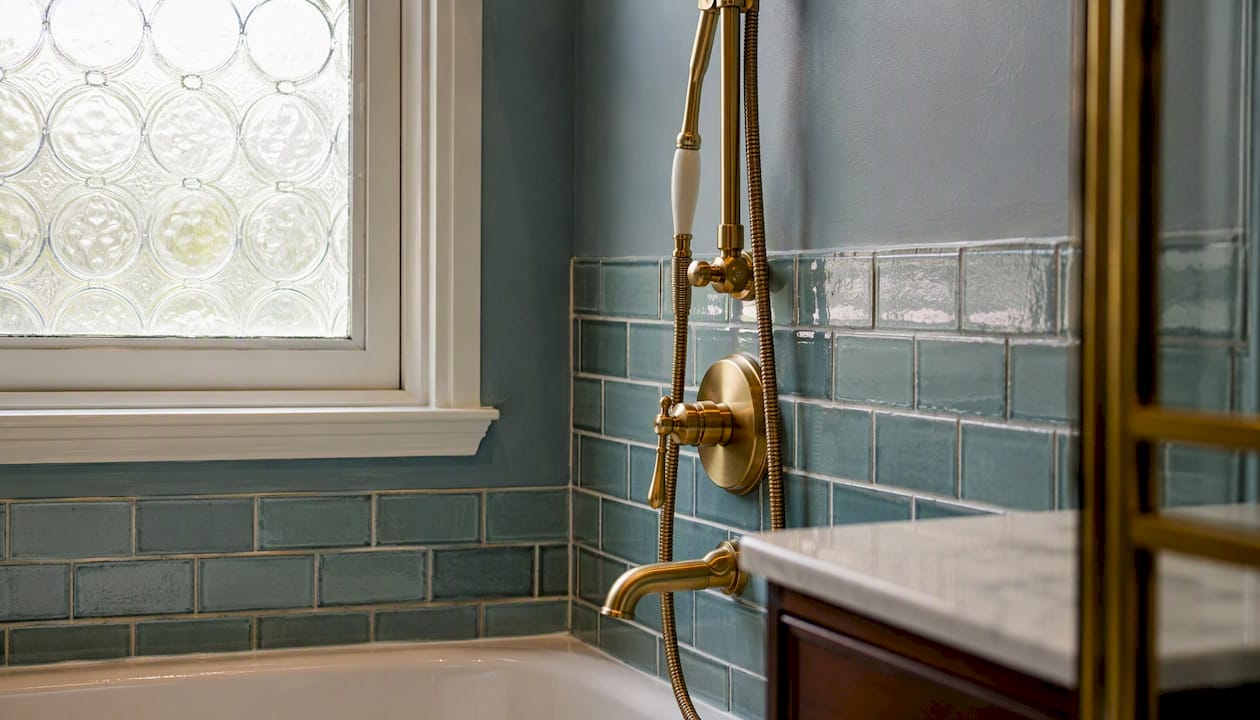
Sea-glass and white tile are a natural pairing. The key detail is the metal finish: warm brass or unlacquered bronze anchors the warmth that a cool sea-glass tile can lose. Use a steam-resistant eggshell or satin finish on walls. A small bathroom can handle a deeper tone like Harbor Navy on all four walls because the enclosed scale makes it feel intentional rather than heavy.
Kitchen
Creamy white or warm greige cabinets with a navy or teal island as the accent is the most durable coastal kitchen formula. Behr’s Sun-Kissed Escape palette shows that warmer accents (coral, warm yellow) can work as a secondary accent on open shelving or a backsplash when the base palette stays sandy and neutral.
Entry, powder room, and exterior
These are the safest places to use deeper tones. Stiffkey Blue (Farrow & Ball 281) on a powder room’s four walls or a front door reads as confident rather than overwhelming because the room is small and the exposure is brief. For beach-style exteriors, Sherwin-Williams recommends sun-washed body tones, warm whites for trim, and muted accents for shutters or doors.
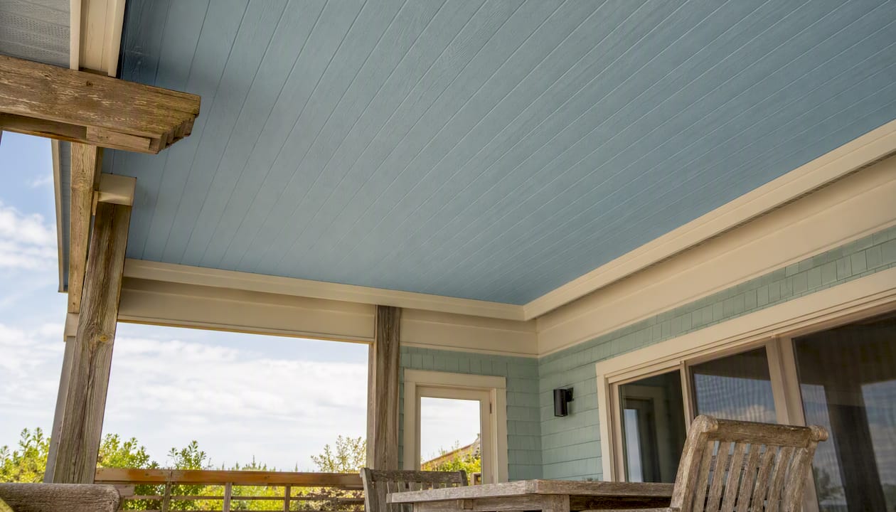
Pro Tip: A pale blue porch ceiling is one of the oldest coastal exterior details in American residential design. It reads as sky from below, extends the outdoor palette upward, and works with almost any warm-neutral body color.
Trim, ceiling, and finish choices that complete a coastal look
The trim color is where most coastal interiors go wrong. Contractor whites with a blue or pink undertone fight the warm sand base and make the whole palette look unresolved. White Dove (BM OC-17) and SW Alabaster are the two most reliable creamy whites for coastal trim because both carry a warm, slightly yellow undertone that harmonizes with sandy neutrals.
Benjamin Moore’s coastal finish guidance recommends ultra-flat for ceilings to reduce glare, matte or eggshell for walls to read weathered and relaxed, and satin or semi-gloss for trim to create purposeful contrast. High gloss belongs on a front door or a single accent element, not on interior walls.
Common trim and finish mistakes to avoid:
- Using a cool, blue-toned white trim against warm sand walls
- Applying satin or semi-gloss sheen to large wall surfaces (it reads as commercial)
- Painting ceilings the same color as walls without adjusting LRV upward
- Skipping primer on previously painted surfaces before switching from cool to warm tones
Ceiling color is underused in coastal interiors. A very pale sky blue (LRV above 85) on a porch ceiling or a sunroom ceiling adds a layer of color without competing with the walls. Keep interior ceilings at a high LRV, typically above 88, so they recede and the room feels taller.
How does light direction change coastal colours in your home?
North-facing rooms receive cool, indirect light all day. Sea Salt in a north-facing room leans distinctly blue-gray rather than green, and Agreeable Gray can read almost lavender. The fix is to shift one undertone warmer: choose Accessible Beige over Agreeable Gray, or pick a sea-glass tone with a stronger green bias.
South-facing rooms are the opposite. Warm afternoon light amplifies yellow and green undertones, so Sea Salt reads greener and warmer. That is usually a benefit in a coastal interior, but it can push a sandy neutral toward orange if the undertone is too yellow.
East and west rooms shift through the day, which is why swatch testing at multiple times matters more than the paint chip alone.
Step-by-step swatch testing:
- Paint a 12-by-12-inch swatch directly on the wall (not on paper or board)
- Observe it at morning light, midday, and evening with lamps on
- Photograph it under neutral white balance, not auto, so the camera doesn’t correct the color
- Hold your trim sample and planned fabric swatches next to it simultaneously
- Check it against the adjacent room’s wall color to confirm the undertones read as a system
Pro Tip: Small rooms feel more grounded with a warmer, slightly darker neutral rather than a very pale color. A powder room in Hale Navy reads as intentional and dramatic; the same room in a pale blue often reads as unfinished.
Which paint brands and codes work best for coastal palettes?
Four brands cover the full range of coastal palettes available at US paint counters. Each has a distinct strength.
Sherwin-Williams is the most accessible for pull-to-counter use. Sea Salt (SW 6204), Agreeable Gray (SW 7029), Accessible Beige (SW 7036), and Evergreen Fog (SW 9130) are all stocked widely and have well-documented LRVs. The HGTV Home by Sherwin-Williams relaxed coastal collection groups these into ready pairings.
Benjamin Moore is the strongest for deep accent blues. Hale Navy (HC-154) and Coastal Blue (794) are the two most cited coastal accents in editorial and designer sources. White Dove (OC-17) is the benchmark creamy trim white that most other brands try to match.
Behr offers the most accessible price point and a solid coastal range. Its Sun-Kissed Escape palette adds warmer accent options (corals, warm yellows) for homeowners who want a more vibrant coastal look rather than the muted sea-glass standard.
Farrow & Ball is the choice for depth and moody coastal interiors. Stiffkey Blue (281) is a near-unique shade: a dark, slightly greenish navy that reads as sophisticated rather than nautical. Pointing (2003) is its best trim companion.
Brand equivalence notes:
- Sea Salt (SW 6204) has no exact BM equivalent; the closest mood match is BM Palladian Blue (HC-144)
- White Dove (BM OC-17) is warmer than SW Extra White; use SW Alabaster as the closer match
- Hale Navy (BM HC-154) is deeper than most SW navy options; SW Naval (SW 6244) is the nearest equivalent
- Stiffkey Blue (F&B 281) has no direct mass-market match; request a custom tint at a Behr or SW counter using the F&B chip as reference
For interior door accent colors in a coastal scheme, semi-gloss in Hale Navy or Stiffkey Blue on a single interior door is one of the most effective ways to introduce the deep accent without committing to a full accent wall.
Finish by surface:
- Walls: matte or eggshell (LRV-accurate, hides imperfections)
- Trim and doors: satin or semi-gloss
- Cabinetry: semi-gloss or cabinet-specific enamel
- Exterior walls: satin exterior formula rated for UV and salt exposure
- Exterior trim: semi-gloss exterior
How to test swatches and prepare before painting
Swatch testing and surface preparation are where the final result is actually decided. A perfect color choice on a poorly prepared surface will fail within two seasons, especially in coastal climates where salt air and UV exposure accelerate paint breakdown.
Swatch testing steps:
- Paint two large swatches (at least 12 by 12 inches) on the actual wall, not on sample boards
- Observe at three times of day: morning, midday, and evening with artificial light on
- Photograph each swatch under neutral white balance for accurate remote review
- Place trim samples, fabric swatches, and flooring samples next to the painted area simultaneously
- Live with the swatches for at least 48 hours before deciding
Surface preparation checklist:
- Clean all surfaces thoroughly to remove salt residue, grease, and mildew
- Sand glossy surfaces to improve adhesion
- Identify and treat any damp, efflorescence, or previous paint failures before priming
- Apply a quality primer suited to the substrate and the finish coat
- Allow full cure time between coats, especially in humid coastal conditions
The Capeapexpainters preparation-first approach addresses damp diagnosis and old paint failures before any new coating goes on, which is the single most important factor in how long a coastal exterior finish lasts.
Pro Tip: Muted, low-saturation colors like Sea Salt and Accessible Beige often need three coats for full, even coverage. Budget for it rather than trying to stretch two coats thin.
For contemporary color combinations on cabinetry and islands, a deep navy or teal island benefits from a cabinet-grade enamel in semi-gloss rather than standard wall paint, which chips at edges under daily use.
How these palettes were chosen
Every palette in this guide was evaluated against three criteria before inclusion.
- LRV and brightness: each color’s LRV was checked against its intended use (wall, trim, accent, ceiling) to confirm it reads as intended in typical room conditions
- Undertone comparison: each color was assessed in warm south light and cool north light to identify undertone shifts and flag chameleons like Sea Salt
- Room-use and finish suitability: colors were matched to room types based on mood, scale, and the finish level appropriate for that surface
Brand mapping used mood, LRV, and undertone rather than literal color copying. Two colors that look identical on a chip can read very differently on a wall at scale, so the equivalences listed are functional matches rather than spectrophotometric ones. Named colors and LRVs are drawn from reputable brand palettes and observational testing across multiple light conditions.
A practical note on coastal palettes in real homes
Salt air, UV exposure, and humidity are not abstract concerns. On a coastal property, an exterior paint system that skips proper surface preparation or uses an interior-grade coating will show failure within 18 months: peeling at edges, chalking on south-facing walls, and efflorescence pushing through from behind.
The colors you choose matter, but the substrate they go onto matters more. Lighter warm colors reflect heat and reduce thermal load on cladding, which extends the life of the paint film. Capeapexpainters specifies coatings for coastal climates and uses in-house teams for surface assessment and preparation, which means the finish you see on day one is the finish that holds through the first few winters.
Sources
- Coastal Color Palette and Paint Ideas | Benjamin Moore
- Modern Beach Cottage Paint Color Palette & Design | Sherwin‑Williams
- Coastal paint color palette: 14 beachy paint schemes (2026) | FacadeColorizer
- Neutral Coastal Paint Colors | HGTV Home® by Sherwin‑Williams
- Coastal Paint Colors – Sun Kissed Escape | Colorfully BEHR
- 6 coastal color schemes for a calm and tranquil home | Homes and Gardens
- 25 Beach Color Palettes for Decorating a Seaside … | The Spruce